September 28, 2026 Post by : Editorial Editing Tutorials
Blue Hour to Golden Hour: Shooting the Full Transition
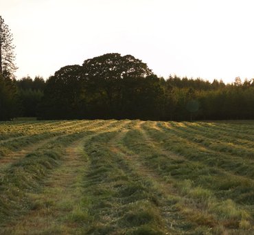
Golden-hour files look gorgeous on the back of the camera and then often fall apart on the screen at home. The warmth that felt magical in the field can read as orange, muddy, or flat once you start editing. The problem is rarely the light itself. It is how we handle it. Warm light compresses a lot of color information into a narrow range of hues, and if you push saturation or contrast carelessly, that range collapses into a single unpleasant tone.
My editing approach starts with restraint. Before touching any color sliders, I set the overall exposure and contrast. Warm light tends to look softer than it is, so I often add a small amount of contrast in the basic panel to give the image structure. I avoid heavy use of the highlights slider, because pulling highlights down too far flattens the glow that made the scene worth shooting. Instead, I use the tone curve to gently roll off the brightest areas while preserving their color.
Separating Warmth From Saturation
The single most useful habit I have developed is treating warmth and saturation as two separate decisions. The temperature slider shifts the overall balance of the image, while saturation and vibrance control intensity. A common mistake is to crank temperature up because the scene felt warm, then crank saturation up because it still looks dull. The result is an orange mess. Instead, I keep temperature close to neutral or only slightly warm, then selectively increase saturation in the specific colors I want to emphasize, usually the reds, oranges, and yellows, while leaving blues and greens alone.
HSL panels are where golden-hour editing really happens. I often reduce the luminance of orange and yellow slightly to give skin tones and foliage more depth, and I shift the hue of orange a few points toward red to avoid that fake tangerine look. If the sky is part of the composition, I may pull blue luminance down a touch to deepen it without affecting the warm foreground.
Protecting Skin Tones and Shadows
Portraits in warm light need special care. Skin reflects the color around it, so a face lit by low sun will naturally skew orange. I use a local adjustment or a subject mask to bring the skin back toward neutral, reducing saturation and slightly cooling the temperature in that area. This lets the background stay warm and glowing while the face remains believable. It sounds fussy, but it takes about thirty seconds once you have done it a few times.
Shadows in golden-hour images deserve attention too. They are often blue or violet, which is part of what makes the light feel dimensional. I resist the urge to neutralize them completely. A little color in the shadows adds depth and separates the subject from the background. If the shadows feel too heavy, I lift them slightly with the curve rather than the shadows slider, which tends to introduce noise and haze.
Finally, I almost always finish with a subtle vignette and a touch of grain. Warm light and clean digital files can feel a little sterile, and a gentle vignette draws the eye toward the brightest part of the frame. None of these moves are dramatic on their own. Stacked together, they turn a good golden-hour capture into an image that feels the way the moment felt.


Author

22 feb,2025
This incident opened my eyes to the value of Insurance in general, so I decided to examine my personal and business insurance.




Comment (3)
The payments are made directly from one person to another without passing through a central bank or clearing house.
22 feb,2025
ReplyThe 40-Minute Window: Timing Golden Hour Like a Pro
23 feb,2025
ReplyScouting a Location Before the Light Arrives
23 feb,2025
Reply